

Uberall
Uberall helps the world’s most innovative brick and mortar businesses stay relevant, competitive, and profitable, by using digital technology to win clicks online and feet offline.
Over 100,000 users and over a million locations rely on Uberall to enhance their digital presence, leveraging digital technology to drive both online engagement and in-store foot traffic.
My Role
At Uberall, I am embedded in three different squads as a Lead Product Designer, leading the design decisions for their respective products, including the Uberall mobile app.
Accomplishments
I led the development of many projects in the mobile app, one of which was Unified Inbox tailored to our target users, collaborating closely with the PM, Front-end and QA Engineers, Marketing, and CSM team (a globally distributed team) to gather insights and identify key pain points.
Through user research, I created intuitive wireframes and prototypes, ensuring alignment between design and business objectives.
By conducting usability tests, I refined the product to enhance functionality and engagement.
My leadership ensured effective communication, guiding each project from concept to successful launch, meeting both user needs and organizational goals.
Project Overview & Timeline
This project focuses on enhancing the mobile app to provide location managers (who are mostly SMBs), with real-time access to their end customer messages and comments directly within the app.

Problem Statement
Following a 29% decrease in "Inbox" (former "Feedback") retention over a quarter in early 2023, an NPS survey revealed that almost 40% of location managers, (specifically this user persona), were dissatisfied with the mobile app.
Business Goals & KPIs
-
Increase the feature adoption rate by 5-10% by SP direct customers (Location managers)
-
Increase the app retention rate by 15-20% between 6-12 months. (5% per quarter)
-
Achieve at least 70% User Satisfaction Score (SUS)
-
Improve Customer Response Time
Results
-
Increased the feature adoption rate by 12%
-
Achieved 83 in SUS score
-
Reduced the average response time to 4-6 hours
-
Increased the app retention by 3% after a quarter

The Process
1.
2.
3.
4.
5.
Research
Diagnosing the Product
Architecture & Strategy
Structuring & Align goals
Design
Design Solutions
Prototype & Test
Validate New Ideas
Refinement &
Measure Success
Iteration & performance metrics
-
Quantitative Data (Heap)
-
Qualitative Data: (Uncovering behaviour)
-
User Testing & Survey
-
Competitive Analysis (Benchmark)
-
CSM Interviews
-
-
Conclusion
-
Story Mapping
-
User Value Matrix (MVP to MLP)
-
Site Map
-
User Flow
-
Wireframing
-
High-fidelity Design
-
New Components
-
Prototyping
-
Usability Testing (Moderated & Unmoderated)
-
A/B testing
-
Final Solution
-
Design QA after implementation
-
Adoption Rate
-
Response time
-
Push Notification
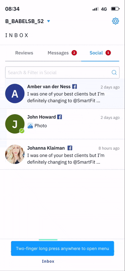
Initial 'Inbox' User Flow
(Former Feedback)
Feedback
Unanswered
Details
Next Review
Response Library
Responding


Hypothesis
-
Customers having problems due to lack of functionality for receiving real-time messages and comments from end customers on their social accounts—a feature currently only available on the desktop version.
-
This gap led them to missed customer interactions, delayed responses, and reduced customer satisfaction, as location managers were unable to manage feedback promptly while on-site.
-
With limited access to laptops on site, they need improved mobile functionality to enhance on-site communication and operational efficiency.
How Might We?
-
How might we create a unified inbox that consolidates messages, comments, and reviews for seamless on-the-go management?
-
How might we reduce response times from 1-2 days to just a few hours by improving mobile functionality?
-
How might we enable location managers to respond to customer interactions more efficiently and flexibly?
-
How might we improve real-time access to customer messages and comments to enhance satisfaction and engagement?
-
How might we design a mobile solution that empowers users to stay connected with their end customers without relying on desktop access?
01.
Research
Diagnosing the Product (Inbox > Mobile app)
Quantitative Data (Source: Heap)
To get started, I gathered quantitative data from Heap, the platform we used back then for product analysis. The purpose was to understand:
-
How long is the response time
-
The percentage of mobile users who have Social and Messages packages in their plan to help us gauge customer demand for these features.
Result of the analysis: -
I understood that response time for Reviews that is available in the mobile app is drastically less (30 min - 3h) than Messages and Social comments (6h to 3 days) which are available ONLY in the web app.
-
The following packages in the platform are available to % of location managers (Users):
% of Users
Packages available
87%
--> Social comments
73%
--> Messages
Qualitative Data
For diagnosing the product, we did a usability testing with 6 users to get 80% of the usability issues. We tested with 6 location managers from Europe from 29-65 years old, who had experience using the mobile app. As a conclusion, we got a 51 in SUS number.
😥 This means that the Current experience is poor.

*To view a complete "Usability Research plan and Test result summary" document showcasing my process, feel free to contact me.*
Findings from user testing
😃 Review Management on the Go:
We love the reviews feature in the mobile app as it makes it much easier for us to respond to our customers, especially addressing negative reviews, anytime and anywhere.
🧐 Improved Efficiency:
Location managers would have appreciated having messages, reviews, and social comments consolidated in one place, significantly reducing the time spent switching between platforms and tabs.

☹️ Delayed Response Times:
Location managers frequently struggle to respond to end customers on time due to the fragmented nature of managing feedback across multiple platforms and as they work on-site.
🆘 Prioritization Challenges:
Some users reported difficulty distinguishing high-priority feedback (e.g., urgent reviews) from general comments, requesting a prioritization feature or filtering options.
Interesting finding that surprised us
😳
Response Library
During usability testing, we were surprised to find that users could not easily access the response library (knowledge base) because it wasn’t located where they expected and was not reachable enough to 70% of users. This made responding to reviews potentially slower. Therefore, we decided to reposition it and measure the response time again.

Benchmark
This section serves as a benchmark for direct competitors in the industry, leading me to conclude that Reviews section is a common feature among all competitors, including us.
-
However, a significant advantage lies in incorporating conversations from directories, as some competitors do.
-
Our strongest differentiator, though, is the ability to receive social comments, a feature none of our competitors offer.
-
Additionally, a unified inbox that consolidates reviews, conversations, and social comments ensures everything is consistent and organized for users in one place. This unique offering positions us as a company with a competitive edge, making it a key strength to attract and retain customers.

*To view a complete "Competitor Research" document showcasing my process (Including SWOT Analysis too), feel free to contact me.*
Customer Success Manager Insights

CSM Team Member in Charge of Mobile
"Customers are seeking a place in the mobile app that consolidates urgent messages, comments, and reviews, allowing them to efficiently manage and respond to customer interactions on the go"
The response times for messages and social comments ranged between 6h - 3 days.
Conclusion (Solution Ideas)
-
Given that a significant portion of customers already have social and messaging packages in the web app, it would be beneficial to integrate these two features into the app.
-
Offering a platform for location managers to efficiently manage their social media messages and comments and reviews on the go.
-
Retaining and redesigning the reviews section and merging with other sections to enhance usability, as it holds significant value for users.
-
Displaying urgent messages for quick attention.
-
Establishing a unified hub to consolidate feedback from end customers.
-
Enabling notifications for messages to ensure prompt responses as fast as possible.
02.
Architecture & Strategy
Structuring and aligning goals
Story mapping
Here’s a glimpse of the work accomplished. The story mapping was conducted with the product trio—consisting of the Product Manager (PM), the Engineering Lead, and the Me as Lead Designer.
Objectives

Choose Location

Respond to reviews & Messages
Manage Feedback notification
Tasks

Login
Access account
Choose Filter
Search
Choose a tempalte
Sending message to users
Go to Setting
Sub-tasks

Enter user & pass
View Location
Press search bar
Press search bar
Press the input
toggle on one of them
choose from response library
Press login button
Press Inbox
Press the filter
type a word
Press the response library button
choose a filter
or type an input
Choose one or more
Choose the review
search for a template
press send button
toggle on the prefered one
Apply the filter
Choose one
User Value Matrix
In order to prioritize the features and determine which are most important based on trio session (from design, technical and business perspective), I created a User Value Matrix and we use MoSCoW method. I was able to see the importance of each feature and stop focusing on low-value and complex concepts.

Filter
Search bar
Pushed notif
Notif setting

show Filters by Location
Reply in bulk
view all cms
Value
New message indicator
Complexity
We conduct story mapping, followed by a user value matrix using the MoSCoW method, to transition from an MVP aimed at testing demand to an MLP designed to drive adoption.
This is a partial view of the value matrix.
Holistic Site Map
.png)
03.
Design
Designing Solutions
User Flow (Ex: Messages)
I create user flows or UML diagrams to ensure a smoother and more effective handover to developers, as these align with their preferred approach and language.

Excluding other flows to keep the content concise and avoid overwhelming the readers.
Wireframing
After extensive wireframing iterations with the product trio, considering technical and time constraints, we finalized the low-fid design in the last iteration.
Social Comments
_PNG.png)
Messages

Reviews (Redesign)

High-end solutions
Messages


Reviews


Social (Comments)


Filters (Second release)


04.
Prototype & Test
Validating solutions (New ideas)
New Components & Prototype
Here’s a look at the sneak peek of the Inbox and social comments in the prototype and some components and variants I have designed to start experimenting with.
News cards


New Modals


Usability testing
I initially used Ballpark for this unmoderated test. After reviewing the results, I checked the heatmaps to identify where drop-offs occurred and discovered a bug in the platform that prevented some users from continuing. As a result, I decided to switch to a moderated test, which allowed me to gather data from 5 representative users.
Result unmoderated:
Unmoderated with 20 users:

Result moderated:
I retested the product and compared the previous experience with the new one, and we got 83 in the new experience. We improved the experience by increasing 32. This means the new experience is more aligned with users’ needs.

A/B test
I also ran an A/B test for a search bar component for our new filter modal with 15 users to determine if they could figure out how to return using the arrow without any text. There was a discussion within the team about users struggling with this, and some of us felt it took up too much vertical space. That's why I wanted to test this with an A/B approach. The search bar that occupied less space emerged as the winning component and was added to the Design System.


05.
Refinement & Measuring Success
Iteration and performance metrics
Design QA
After the implementation, I conducted a design QA for the developers and identified some UI changes that needed to be addressed.
Push Notification
Following the entire process, implementation, and release, adoption was initially low, with a feature adoption rate of only 2% for replying to messages and comments in the first three weeks. After investigating further, we discovered an issue with push notifications that prevented customers from seeing incoming messages. Once this was resolved, we achieved excellent results.
Final outcome
-
44% increase in response library icon taps and a 15% decrease in "reviews" response time compared to before
-
Increased the feature adoption rate by 12%
-
Achieved 83 in SUS
-
Reduced the average response time (Messages & Comments) to 4-6 hours (approximately 87.18%)
-
Increased the app retention by 3% after a quarter
Takeaways
-
Technical limitations: Since the mobile APIs are connected to the web app, there are several technical limitations that hinder the implementation of certain features.
-
Collaboration and Communication: Clear communication among team members and stakeholders proved essential to keeping the project on track despite challenges.
-
Time Constraints: Due to limited time, certain advanced features, such as AI-driven response suggestions, had to be deprioritized.
-
Envisioning a great experience: Even though the Inbox flow was improved, we envision the future with a smoother experience, by creating new performing components and adding them to our current design system.
-
What I would do differently: I would skip unmoderated testing and go straight to moderated testing, as it provides more accurate results. Additionally, the unmoderated approach had bugs that affected the reliability of user data.

Feedback from The Mobile App Tech/ Engineering Lead
Next Releases
-
Scale the feature by tailoring the inbox experience for single-location and multi-location managers.
-
Expand the app's directories to enable message reception through the inbox.
-
Enhance components and improve the overall user experience.